In the drive to accelerate progress towards the Sustainable Development Goals (SDGs), high quality data is needed to increase accountability, effectiveness and efficiency. But turning data into meaningful messages can be a challenge. Where do you start? Which visualisations do you choose? How do you turn your data into a compelling story? Follow these five steps and translate your insights into stories that matter.
#1 Understand the context
The value of data comes from what people do with it. For data to be actionable, it needs to be transformed from raw numbers into other formats and shapes. But how do you go about this? A thorough understanding of context is essential. Always ask the following questions before you begin:
Who?
If you try to tell your story to too many people, you won’t be able to communicate effectively with any of them. Who needs to hear this story in order to take action? For example, if you’re looking to get funding approved for the continuation of a learning programme, you should tell your story to the budget committee.
What?
Ensure that you know and understand what the goal of your data storytelling is. The story you’re telling should always lead to your audience knowing or doing something. For example, you may want to show that the learning programme was a success so that the budget for further funding is approved.
How?
What available data will help you make your point? The data you use will be the supporting evidence of the story you build and tell. For example, you can illustrate the success of a programme by showing the results of surveys conducted before and after an intervention.
#2 Talk to your audience
Start by identifying who you’ll be sharing the data or main indicators with. What kind of organisation or community do they belong to? What is their position within the organisation or community? What are their main interests and do they have the authority to act?
Determine the best channel
Storytelling is most effective in person, whether this is in a meeting or part of a larger event such as a conference. It’s ideal if the context of the event fits the goal of the data story, as the topic will already be on your audience’s mind. With decision makers present, your data story will be more likely to effect change.
A more elaborate approach may be necessary if, for example, many stakeholders are involved. Focus on the key players and determine which channels will be most effective in reaching them, whether that’s in writing (printed or online) or through traditional media such as radio and television.
Find the right format
Once the channel is decided, you can choose your format. The form of the data story should guide the reader and ensure that they have no difficulty whatsoever in understanding the information. Don’t assume that a chart or graph is self-explanatory; bring focus and context to your chart by adding annotations to key figures or concluding with a short narrative.
Last but not least, find out whether your data storytelling effort was effective. Check the results by collecting evidence on what changed after your storytelling and learn from your findings.
#3 Choose your charts
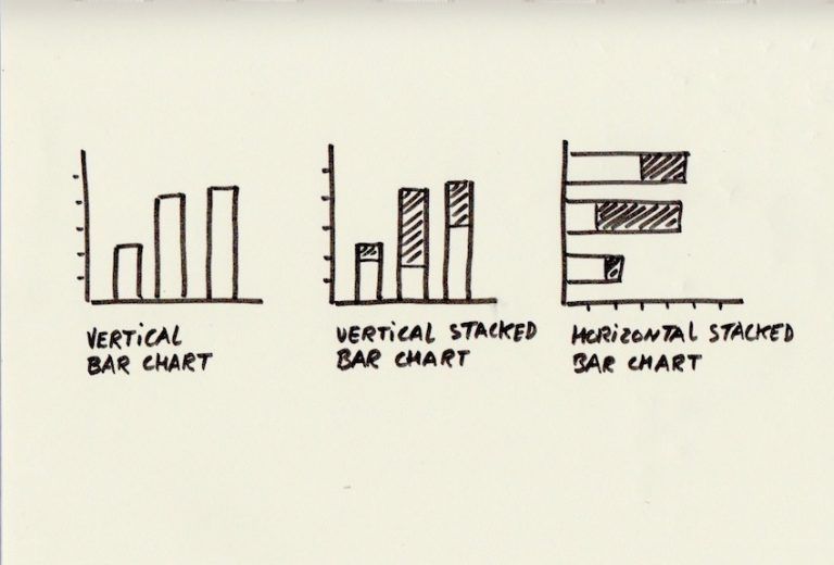
Above: Bar charts by Marten Schoonman.
Sourcing the data, ensuring its quality and performing analyses will provide you with a solid ground for creating compelling visuals. There is a large variety of charts to choose from. Choosing the best fit is an interplay between the analysis possibilities the data provides, the story you want to tell, and the characteristics of the audience. If you make complicated graphics that require a lot of explanation, you risk losing your audience’s attention or confusing them with too much information.
When it comes to data visualisation, you are probably trying to show one of the four things with your data:
Relationship: when you are focusing on showing a connection or correlation between two or more variables. For example, you may want to show how the functionality of a waterpoint relates to its age. Best choice: Any type of bar chart.
Comparison: when you want to distinguish between two or more variables. You want to illustrate how the two variables interact, such as the number of water points in the five biggest districts in the country. Best choice: Any type of bar chart.
Composition: when you collect different types of information that make up a whole and display them together. For example, you may want to show the different founders of water points in the whole country. Best choice: Stacked bar chart.
Distribution: when you want to lay out a collection of related or unrelated information simply to see how it correlates. You may want to display the number of reported water point malfunctions over a long time period and see if you can find seasonal patterns in the functionality. Best Choice: Vertical bar chart.
Warning! Watch out for creating a misleading graph. For example, a chart that tries to show a significant difference between two values by distorting the axis. The values only seem different because the axis doesn’t begin at zero. And watch out for pie charts. Using them to represent data is either impossible to read or gives a distorted view, mainly because it is up to the viewer to try to judge the size of the parts of the pie. As data scientist Karolina Sarna says: “Pies are just good for eating, not for chart making.”

Above: A chart created and broadcast by Fox News. Because the vertical axis does not start at zero, the first impression is a much larger gap than what is really the case. Image from Justin Wolfers on Twitter.
#4 Think like a designer
The presentation of the data needs to fit the context and audience to be effective and reach its goals. The easier it can be consumed, the better.
Eliminate clutter
Identify anything that isn’t adding informative value, or isn’t adding enough informative value to justify its presence, and remove those things. You are a designer of information, so be smart about how you use the brain power of your audience. Every element you add to a blank page or a blank screen takes up a cognitive load on the part of the audience. Any visual element that takes up space but doesn’t increase understanding is clutter.
Create a visual hierarchy
Use preattentive attributes like size, colour and position in your design. That way, you’ll create a visual hierarchy of elements to lead your audience through the information. An important number can be displayed in a large font, the most important bar in a bar chart can be coloured red and the key visual, conclusion or recommendation is shown first.
Test it!
It may be a challenge to judge what your audience finds easy to read, so check with others whether your chart is clear to them. Questions you can ask are: Where do you focus? What do you see? What observations do you make? What questions do you have?
Above: How to eliminate clutter from a graph by Karolina Sarna. Gif by Linda Leunissen.
#5 Tell a story
Stories bring facts to life. Your audience may hear facts if you present them, but they won’t remember them if they aren’t contextualised within a narrative. In fact, when people read straight data, only the language part of the brain is activated to decode the meaning. But when we read a story, any other part of the brain that we would use if we were actually experiencing what we’re reading about becomes activated as well. This means it’s far easier for us to remember and be moved to action by stories than hard facts.
Structure your story
Are you just making a point or are you telling a story? An effective story often starts with a question, builds tension, and answers with a call to action to solve the question. Of course, the question should be something the audience cares about. Set the scene and work your way to the story’s climax. At this point, the key question is answered and the audience feel compelled to take action.
Add emotion
People are driven by emotions. Facts alone are not enough to change behaviour or influence decision making. Is there an emotional appeal in your story? Not just something that makes the listener feel sad or angry, but something that provokes a heartfelt response and makes them think: “this is unacceptable, we need to take action.”
Do you want to turn your insights into stories that matter? Get in touch with us.
This blog was written with input from data scientist Karolina Sarna.