
The cooperation between Akvo and ICCO Cooperation goes back to 2012 when ICCO piloted Akvo Flow in Indonesia. The use of Flow led to a huge boost in the quantity and quality of information gathered. Economic empowerment and food security are at the heart of ICCO’s work, and information regarding farmers’ earnings, community eating patterns, crop growth and various other characteristics led to a better understanding of what does and doesn’t work in ICCO’s programmes. The wealth of data, however, also led to new questions and new possibilities.
Akvo and ICCO set up a joint learning trajectory to tackle some of these questions. Instead of performing a standard analysis of data and summarising it, we reached for more advanced statistical methods. Using data science techniques on the data we’d already collected, we could improve the design of surveys, capitalise on best practices and lessons learned, and discover hidden patterns in the data.
Multiple Correspondence Analysis
We analysed data gathered in Ethiopia, India and Tanzania. The Ethiopian strategic partnership programme focuses on dialogue for a sustainable and inclusive food system in food insecure districts while supporting smallholder farmers, especially in the potato and malt barley value chains. The datasets contain information about hunger and people’s diets, and are essential in initiating effective discussions with local authorities. The Indian project targets the income and food situation of tea estate farmers, while the Tanzanian case gathered data on the communities targeted by the Amsterdam initiative against malnutrition (AIM) programmes. In the latter, 4,000 small-scale farmers were trained to improve production, post-harvest handling, marketing and consumption of nutritious vegetables.
In all three cases, we used two standardised and internationally validated surveys to gather household data: the household food insecurity access scale (HFIAS) and the dietary diversity score (DDS). In addition, general household data was collected, including gender, age groups and locations. In order to get a deeper look at the data, we combined the three datasets to perform a multiple correspondence analysis (MCA).
MCA is a way of summarising and visualising a dataset which contains two or more categorical variables. All data points are represented on a Euclidean space, which is simply a flat space, like the screen of your computer; if you draw two points on your screen, the shortest distance between them will always be a straight line. Using MCA, and based on the locations of the data points, we were able to detect underlying patterns and see which households’ characteristics were associated with each other. This method allows us to look beyond the specific hypothesis we want to prove or disprove, and look at the whole dataset without preconceptions.
Deeper understanding
Thanks to the application of MCA, we were able to find things that we expected and new, surprising connections which we otherwise wouldn’t have seen. We discovered, for example, that respondents that were part of a self-help group were likely to give comparable answers to all the other questions, from “did you worry that your household would not have enough food at any time during last month?” to “did the respondent eat dark green leafy vegetables yesterday?”. This is a great example of how computers can help us in deepening our understanding of data. The likelihood that we would have discovered this pattern ourselves – by deciding ourselves which variable to combine – is not very high.
If we treat every question as a different variable, the goal of MCA is to reduce the number of variables by choosing only those that are responsible for the biggest variance in the dataset. In other words, we can see what separates households the most and assume that those differences are the most important ones. In this way we can identify:
- A group of individuals with similar profiles in their answers to the questions
- The associations between variable categories
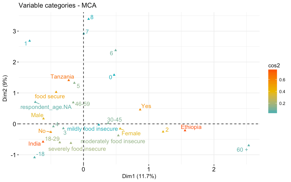
Figure one: Representation of the variable categories and their quality of the representation – the squared cosine (cos2) for the analysed datasets.
The image above shows the relationships between variable categories. Variable categories with a similar profile are grouped together. For example, we can see that Tanzania is located close to the “food secure” variable. This means that there is an association between the food secure households and Tanzania. If we look at the distribution of HFIAS categories per country (figure two) we can see that most of the surveyed households in Tanzania were food secure.
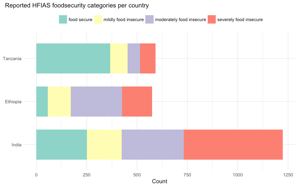
Figure two: Distribution of the reported HFIAS food security category per country.
Comparing with care
As we mentioned before, by using MCA we are projecting data on a two-dimensional plane. To make sure that all the variable categories are well displayed in those two dimensions, we also need to consider the quality of the representation. The quality of the representation is called the squared cosine (cos2) and it measures the degree of association between variable categories and a particular dimension. If a variable category is well represented by two dimensions, then the sum of the cos2 is close to one. We can see in figure one that, not surprisingly, the country where the survey is conducted is particularly relevant. Ethiopia, India and Tanzania score the highest cos2 values. This is an important learning from this exercise and something that we always assume but rarely have a proof of – the context of each country is different, therefore comparing the same surveys gathered in different countries is very complex and needs to be done with care.
Figure three represents the location of the individuals rather than of the variable categories. In this plot, we can see how each individual respondent relates to the others. The location of every respondent is based on the whole profile of their answers, hence two respondents with similar answers will be located next to each other and with different answers far from each other.
We coloured the dots on the plot according to the country where the survey was conducted and can clearly see that the same colour of dots creates clear clusters of points. As mentioned before, this is a clear indication that the country-specific context creates the biggest differences between the answer profiles.
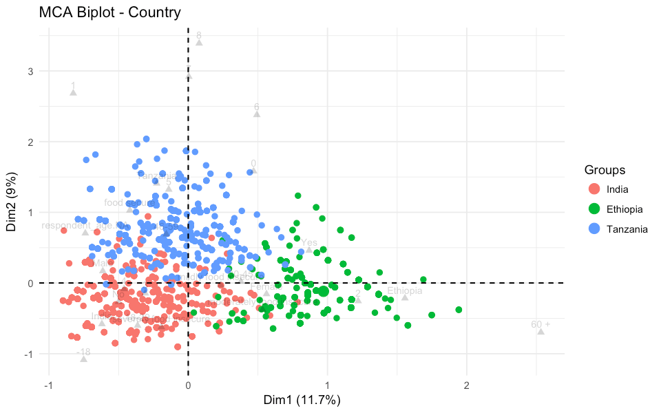
Figure three: Representation of individuals coloured by the country of the household.
Plotting the same information but using colour to distinguish between the different HFIAS food security categories shows that the differences between them are not clearly defined (figure four).
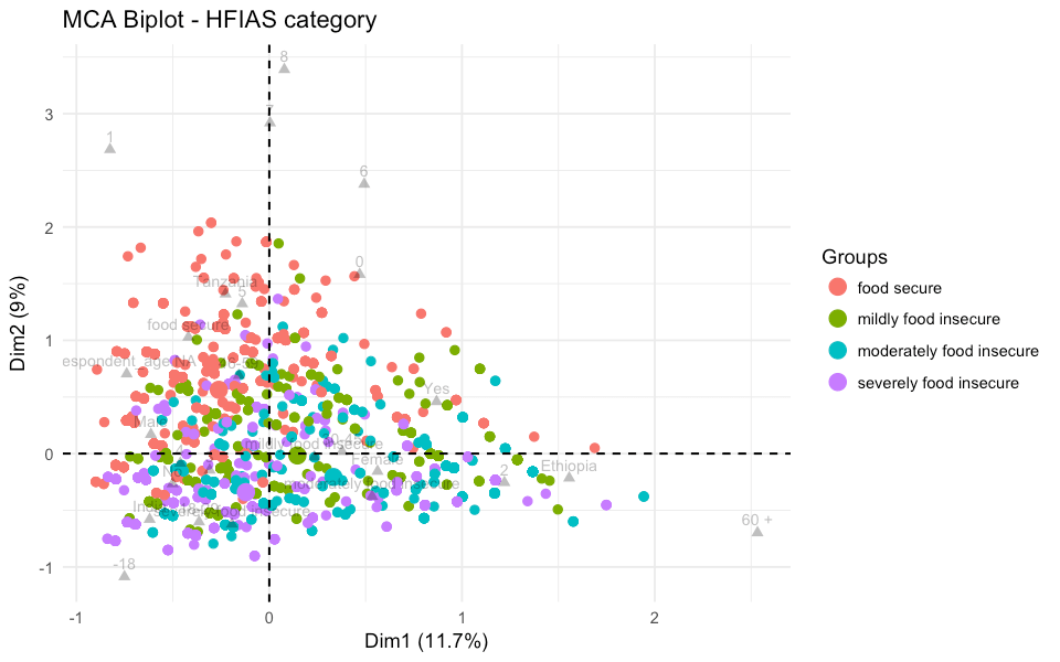
Figure four: Representation of individuals coloured by the food security category of the household.
Doing advanced statistical analysis with R, a statistical computing software, on multiple datasets is a new area for ICCO, and we’ve come away with some important tips. Firstly, working with standardised surveys allows for comparison between datasets, but we need to be careful about translating the context of one country to the other. The further standardisation of surveys that can be conducted in several countries will support more advanced analysis. In this article, the self-help group example was indicative of this, since this question isn’t standardised in our surveys. We might consider asking this question more regularly. This advanced analysis might lead to using fewer questions in future surveys, although it is too soon to draw this conclusion. We’ll continue working to improve our surveys so that we can only ask the questions that are really needed to generate the relevant insights.
Do you want to discover the hidden patterns in your data? Get in touch.
Written by Karolina Sarna, data scientist at Akvo, and Martijn Marijnis, planning, monitoring and evaluation advisor at ICCO Cooperation.