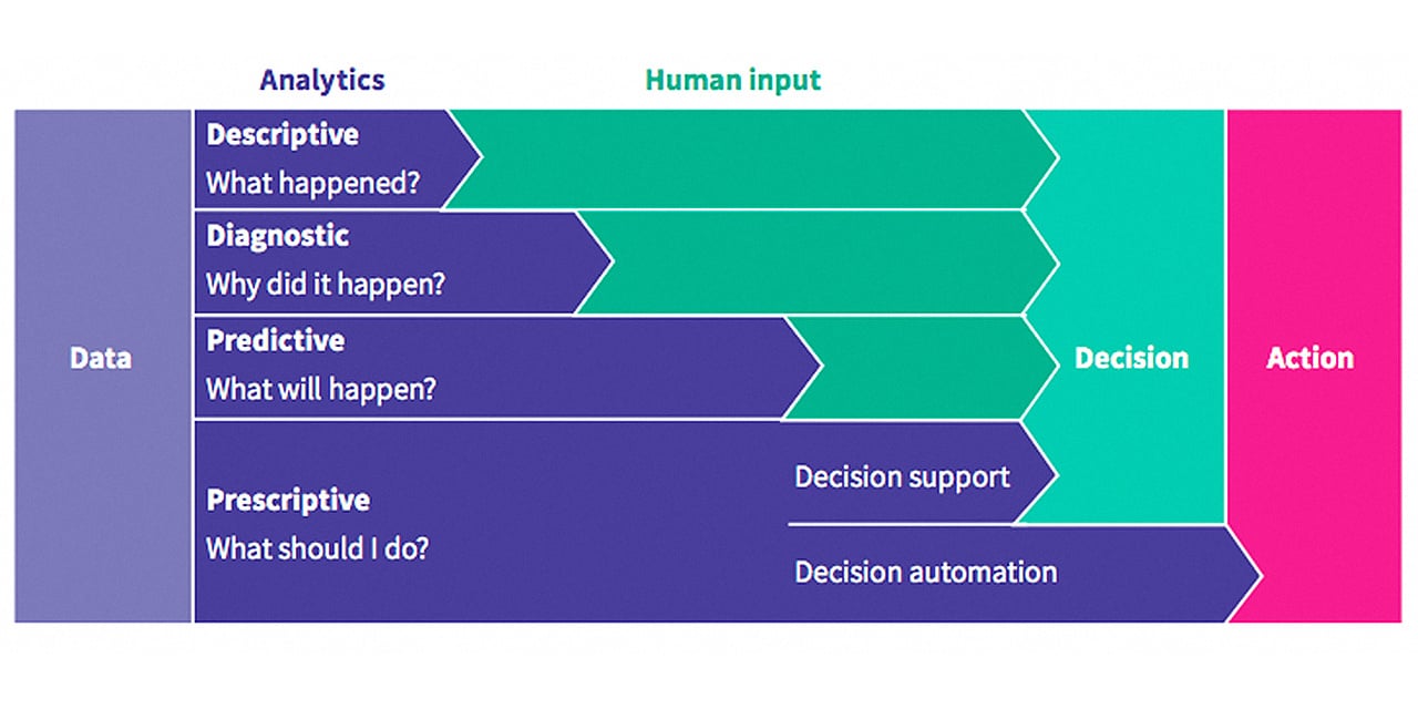
There are multiple ways to make sense out of data. The method you choose depends on the questions you’re asking and the information you're looking to get from your dataset. If you want to explain what has happened and why, descriptive and diagnostic analytics will come in handy. If the questions relate more to what could happen in the future, you'll want to use predictive and prescriptive analytics. In this blog, we'll walk you through the four types of data analysis, when you should apply them, and why.
Descriptive analytics - What happened?
Descriptive analytics is the first step in data analysis. The goal of descriptive analytics is to find out what happened? For example, what was the average revenue for the month of January? Or how many children between the ages of two and ten attend school? It’s the first layer of information that you can get from the data you’ve collected, either with or without adding data from other sources.
If you’re an analyst, you might not know in detail, or at all, what happened that led to the dataset you need to analyse. If this is the case, it’s important to seek out context on the sample you’re looking at and the population it was drawn from. For a more detailed guide on the importance of sampling strategies, check out this blog: How to choose your sampling strategy to guarantee relevant results.
If you’re a project officer or programme manager, you may already have a good idea of the information your data contains. You may have been involved in the data collection, perhaps even the sampling, and you might have knowledge of what went well and what didn’t. Questions that are important to keep in mind when looking at descriptive statistics are:
- Did I reach my required sample size?
- Were there any local conditions that might have influenced my data? For example, weather conditions that forced you to use other participants than intended.
To show how best to approach data analysis, we'll use an example dataset which you can view here: Example WaSH dataset.
Tables and bar charts
The easiest and quickest way to look into your data is by using (frequency) tables and bar charts. This only goes for nominal and sometimes ordinal data, as described in this blog: How to design your data for effective data use. Making use of the pivot table function in excel, for example, allows you to depict a lot of information. Start with variables that describe your sample, such as gender, as shown in the table below. This will give you an idea of the characteristics of the respondents. A deviation in these characteristics can give you insight into the variables you set out to measure and your potential findings.

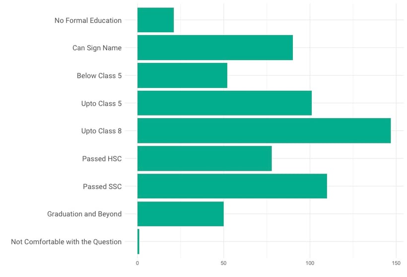
You may already have an idea of how certain variables will be represented in your sample. In this case, making a bar chart will offer a lot of insight. The table below shows the education level of the participants, which could be seen as an ordinal variable. By observing this variable in a bar chart instead of a table, you immediately get a sense of the average education levels. In later analyses this can be translated to, for example, how many of them can read or write.
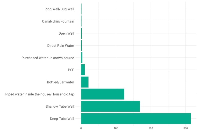
After looking at sample characteristics, you can start making overviews of the variables of interest. The table below shows an overview of the types of water sources represented in the data.
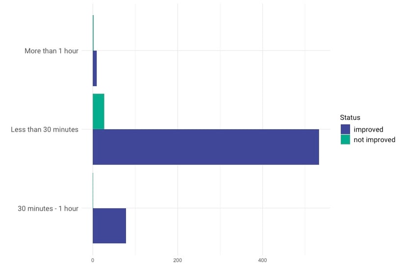
The distinction between different water sources alone is not enough to indicate the quality of the water facilities. Other variables impact the quality of the source, such as the walking distance from the household to the source, whether or not you have to wait in line to get water, and whether animals can use the source as well. The bar chart below shows the combination of the type of water source, here categorised as “improved” or “unimproved,” combined with the length of the trip to the water source. Combining these variables gives more information about the quality of the water facilities. The World Health Organisation (WHO) introduced standards to classify a water source as improved or unimproved. See this introduction to drinking water for more information about this distinction.
Histograms
A more advanced way of looking at your ratio or interval variables can be achieved by making a histogram. A histogram visualises the distribution of data over a continuous interval and can be used to see how your data is deviated. For example, if we look at the number of household members, we expect the sample to follow a normal distribution. This basically means you have observations centred around a mean with equal deviations to both sides. Take a look at this lecture by Andy Field for information on the assumption of normality and other forms of bias. The histogram below shows the distribution of the number of household members.
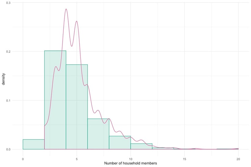
When looking at the distribution, you can see that the bars are skewed to the right. This implies that there are a few large households in the set compared to the average. Given that the sample is representative, these data points, and therefore the households, could be outliers. If your sample is not representative, it could mean that you have sampled among the smaller households, and that in reality the mean is higher. If you are in the business of hypothesis testing, this distinction is important.
Diagnostic analytics - Why did this happen?
When you have an overview of what is in your data and what your sample looks like, you might want to know why certain things are happening. Maybe you found that in one district, far less children attend school than in the other districts. Could there be something in your data that shows other ways in which this district is different? With diagnostic analytics, we can go one step deeper and ask the question: Why did this happen? Again, we will use the example dataset to give you some examples.
To see why certain behaviour is observed, we can look at a combination of variables. For example, which district has the most unimproved water sources? Is it primarily women who are reporting long walking distances? Are water sources more often broken when they are not looked after by the municipality? The graph below shows the ownership of water sources compared to whether the well is functional or not. You might wonder whether the municipalities take good care of the wells or whether the interviewees have enough experience to take care of the well themselves. In this case, you can see that the private wells are a lot more often functional than those installed by the municipalities.
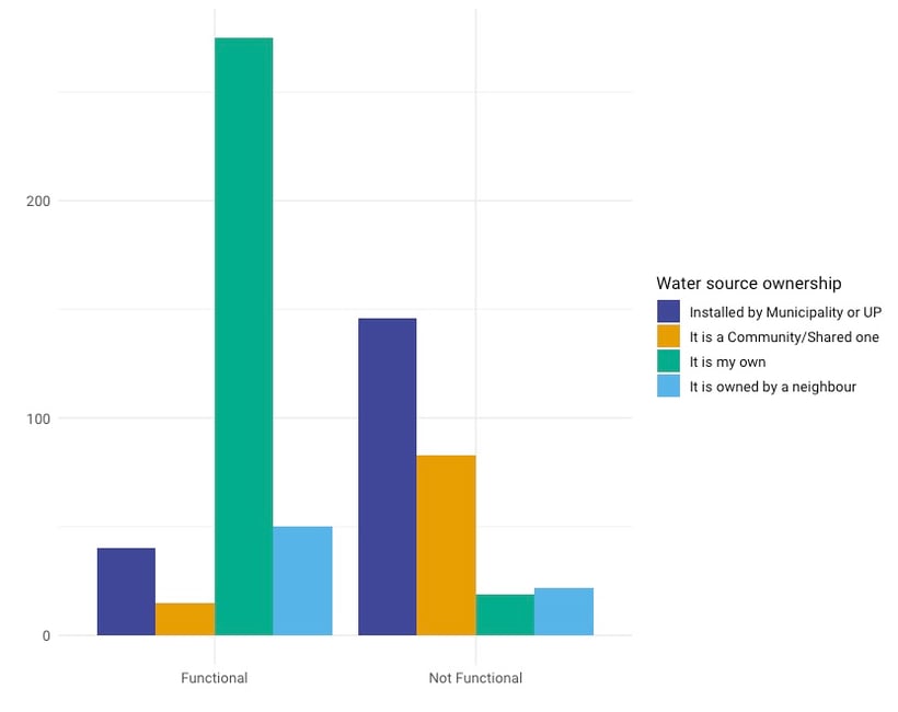
The questions you ask, and the variables you combine, can be based on previous research, by hunches or observations during data collection, or they could be explorative, meaning you found them in the data. When you are working with sampled data, the distinction between how you get to these findings is very important. With the bar chart above, you might have had a reason to investigate water source ownership. For example, qualitative research showed you that the local municipality is understaffed.
When you formulate a research question and an accompanying hypothesis in advance, and you have a representative sample, you can test whether the hypothesis can be confirmed using statistical inference. Statistical inference refers to the use of statistics to draw conclusions about some unknown aspect of a population based on a random sample from that population. When you can indeed confirm your hypothesis, you can assume that the behaviour you find is something that goes for the entire population. In our case, you could use this to advocate for more staff in the municipality.
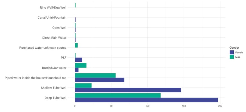
If your findings are explorative, you cannot make this assumption. The graph below shows the different water sources split according to the gender of the respondent. You can see that women seem to report a lot more shallow tube wells. If you never had any reason to expect this difference, you have to be aware of the fact that this could be a chance finding. As we saw in the descriptive analytics part, there were a lot more female respondents, which could account for this difference.
Predictive analytics - What is likely to happen?
By the time you know why something happened, we might go as far as predicting what is likely to happen next, given our knowledge of previous events. Predictive analytics tries to answer the question: What is likely to happen? By using what we learned with descriptive and diagnostic analytics, we can use predictive analytics to look at clusters, tendencies or maybe exceptions that allow us to make a certain prediction.
Let's say that during the diagnostic analysis, you found that shallow tube wells built on a clay surface are often broken when older than five years. This information can be used to investigate the remainder of your population and make an estimate of which wells might need repairing without actually knowing they are broken. These findings are often referred to as patterns in the data. There are generally two ways of looking at these patterns: supervised (e.g. regression) or unsupervised (e.g. clustering).
There are more advanced techniques in predictive analytics that allow you to search for patterns in your data and confirm them at the same time. Let’s say, for example, you collected data about water source wells. You know the type, when they were built, who is maintaining them, if they are broken or not, and you used additional data to determine the kind of soil the wells are built on. By feeding this data into a predictive model, you can make a model that allows you to predict when a new well, one that wasn’t part of your initial data, might break down. One of these predictive models is logistic regression. Again, see how statistics professor Andy Field explains this concept in this video.
Prescriptive analytics - What should be done?
Now that you have an idea of what is likely to happen, you might want to know what the best course of action is. Prescriptive analytics tries to answer the question: What should be done? or what can we do to make ... happen? Prescriptive analytics is mostly used in large companies that are looking for advice on, for example, their inventory or supply chain. It goes one step further than descriptive and predictive analytics by recommending possible outcomes. Essentially, you can predict multiple futures and allow companies to assess a number of possible outcomes based upon their actions.
For more tips and tricks on data analysis, download our eBook!

%20advert%20Data%20journey%20blog%20post.png?width=850&name=eBook3%20(Understand)%20advert%20Data%20journey%20blog%20post.png)
